
Maps projections – A history
In the earliest days of human civilisation, people would move around on land and know the local landscape well enough to navigate using landmarks. As we spread across the globe however, the sheer size of the Earth led to the necessity of drawing maps as guides for traders and explorers.
The earliest known map dates back 2600 years to Babylon. From this time until 1492, maps of the world only included Europe, Asia and Africa. After the voyages of Columbus and Magellan, maps started appearing that included North and South America. It was nearly another 300 years before Australia, New Zealand and Antarctica were discovered and the full extent of the shape of the world could be visualised.
Over time, the most effective means of creating maps has been using projections. A projection is a systematic method of drawing the Earth’s meridians and parallels on a flat surface, which is very effective but riddled with inaccuracies. This is due to the distortions that occur during the process of transferring a 3-dimensional object onto a 2-dimensional surface. Over time, several approaches have been presented for reducing distortion when transforming a spherical surface into a flat map. These include:
- first mapping the sphere into an intermediate zero-Gaussian curvature surface like a cylinder or a cone, then converting the surface into a plane
- partially cutting the sphere and separately projecting each division in an interrupted map.
Map projections onto a 2-dimensional surface
The surface of a sphere cannot be represented as a plane without some form of distortion. Karl Friedrich Gauss mathematically proved this in the 1800’s. Since the 1500’s mathematicians have worked on ways to accurately translate the globe into something flat and they have found that the best way of doing this is to use a process called projection.
Popular rectangular maps use a cylindrical projection as shown below:
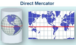
In the above case, each point on the sphere is projected onto the surface of the cylinder which is then unrolled creating a flat rectangular map. However, you can also project the map onto other surfaces. In all cases, the maths used by map makers to project the globe will affect the way it looks once it’s flattened out.

There are many, many different types of map projections, but each of these come with various sacrifices to shape, distance, direction and land area. Depending on the projection, every map has advantages and disadvantages in each of these areas.
One of the most popular maps is called the Mercator projection. It is the map most commonly used in schools and by Google Maps because it works really well in preserving the general shape of countries. In other words, Australia on the globe looks like Australia on the map. The original purpose of the Mercator projection was for navigation however because it preserves direction exceptionally well, an important aspect if you are trying to navigate the oceans using only a compass. It was originally designed so that a line drawn between two countries on a map gave the exact angle to travel on a compass. This route was not necessarily the shortest, but it was a simple, accurate and reliable way to navigate across the oceans.
Gerardus Mercator created his map in the 15th century and he was able to preserve this direction by varying the distance between the lines of latitude so that they were closer together near the equator and further away at the poles. This created a grid of right angles across the map.
The Mercator map was a great rudimentary map for the purposed outlined above. However, this type of mapping created specific problems with the area and size of different countries relative on their position on the globe. For example, countries located closer to the poles appear to be larger in size than those nearer to the equator even though their actual area was vastly different.
Take a look at the size of Greenland compared to Australia on the Mercator map below. It appears larger in area even though Greenland’s area is only 2,166,086 km2 compared to Australia’s 7,692,024 km2.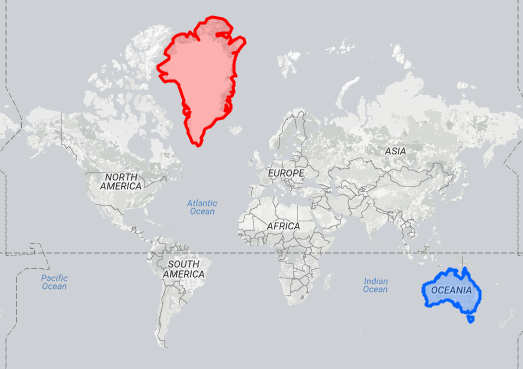
The image below shows Greenland and Australia superimposed, indicating their true size. As can be seen, this displays a vastly different image and representation of their sizes than how they appear on the Mercator.
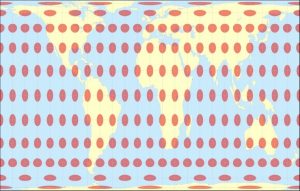
So why does such a discrepancy occur? The reason for this size disparity soon becomes clear if we place equal sized dots all over the globe at equivalent intervals and project this onto the Mercator map. As can be seen below, the circles retain their round shape throughout the projection, but are enlarged as they get closer to the poles.

The Gall-Peters map, also known as an equal area map is another rectangular map projection that more accurately displays land area. Unfortunately, although the area of the countries is preserved in this type of projection, the shape of the countries becomes quite distorted as shown below. Due to this dramatic distortion, the Gall-Peters map is not popular among map enthusiasts who prefer one that is more visually pleasing.
With the development of Global Positioning Systems (GPS), the need for using paper maps has significantly reduced and any modern projections have become more about aesthetics, design and presentation. The Mercator no longer fits the bill with modern cartographers who see it as misleading. However, Google Maps still uses it because of its ability to preserve direction, an important part of the program’s functionality.
Most cartographers these days have settled on maps that split the difference between the distortion of size and shape and in 1998, The National Geographic Society adopted the Winkel-Tripel projection because of its balance between size and shape accuracy (below). Prior to this time, the Winkel-Tripel was not considered particularly exceptional and it was a relatively obscure map.

Examples of other types of projections
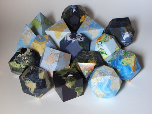
Polyhedral Projections
Polyhedral map projections are an interesting solution to the problem of accurately representing curved features on flat surfaces while minimizing the distortion of cartographic properties.
The techniques described in part one are combined when creating polyhedral maps. To create these kinds of maps, cartographers generally inscribe the sphere in a given polyhedron, then separately project regions of the sphere onto each polyhedral face. These polyhedra are then cut along each edge to create a net and in turn, a 2-dimensional map.
The distortion in polyhedral maps can be quite significant, particularly at the vertices where the polyhedron is further away from the inscribed sphere. However, increasing the number of faces can greatly reduce the distortion. After all, a sphere is just a polyhedron with infinitely many faces.
The five regular or platonic solids are natural candidates for polyhedral maps. These include tetrahedrons, cubes, octahedrons, dodecahedrons and icosahedrons. Tetrahedral maps are generally considered unacceptable however, due to the exaggerated distortion near the vertices.
The most commonly used projections for polyhedral maps is the Gnomonic projection. Gnomonic projection maps are created by projecting points on the surface of the sphere, from the sphere’s center, to a point on the plane that is tangent to the surface.
These Gnomonic projections have a greater expansion, away from the origin, than a conformal projection giving it quite a distorted appearance, but it also has some quite useful properties. The way gnomonic maps are constructed means that all great circles on the globe are represented by straight lines on the map. This makes it very useful in plotting great circle routes between arbitrary destinations, which is extremely important for flight paths.

Acknowledgments
https://www.youtube.com/watch?v=kIID5FDi2JQ
http://www.progonos.com/furuti/MapProj/Normal/ProjPoly/projPoly.html
http://www.quadibloc.com/maps/maz0201.htm
https://www.icsm.gov.au/education/fundamentals-mapping/history-mapping
